
Tutorial & code
Responsive Grids
A simple CSS tweak to give more flexibility creating responsive grids using Beaver Builder columns.
Minimum BB plugin required: Lite Saved under: Layouts
Skill level: Intermediate Contributor: David Waumsley
Template Location
Video
Notes
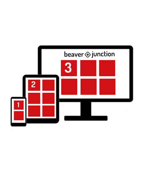
When we add Beaver Builder columns to our pages we are adding column groups. They display as show on desktop devices, but by default stack as columns on columns on tablets and mobiles.
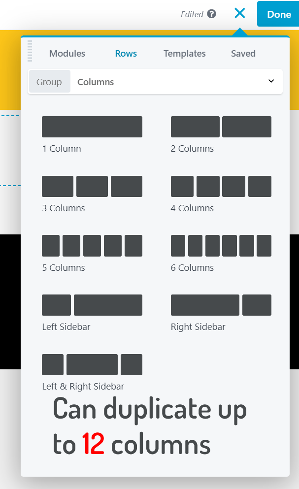
If we want a more flexible grid we can add 6 columns and duplicate them to up to 12. With the CSS (below) we can turn these in to a grid on desktop and use the Beaver Builder column settings to arrange things different on smaller sizes.
See the Responsive Grids template in action.
Code
CSS
/* This makes a 12 column group display as 2 x 6 on desktop.
It's targeting the individual columns in the row
allowing other columns to be added without being affected*/

@media (min-width: 992px){
.column-one, .column-two, .column-three, .column-four, .column-five, .column-six,
.column-seven, .column-eight, .column-nine, .column-ten, .column-eleven, .column-twelve {
width: 16.66%!important;
}
}

/* 3 = 33.33% 4 = 25% 5 + 20% 6 + 16.66% */

If you want the above to apply to all columns in a row you add a row selector and use this instead:

@media (min-width:992px){/* 992px is BB default width */
.row-selector-name .fl-col {
width: 20% !important;
}
}