
Tutorial & code
Modal Box with Button
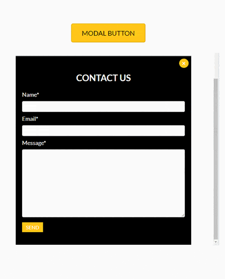
A simple modal (popup) with CSS and JS taken from W3 Schools. It uses a Beaver Builder shortcode to show a saved template. Beaver Builder Lite users will need to add some HTML.
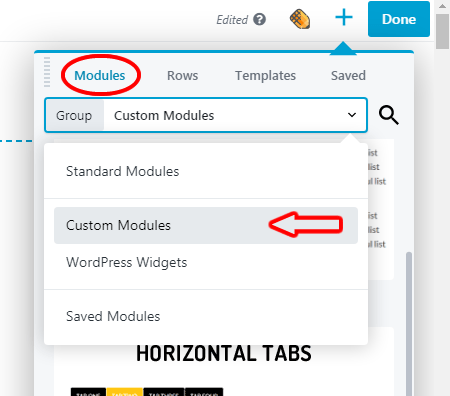
Minimum BB plugin required: Lite Saved under: Modules
Skill level: Intermediate Contributor: David Waumsley
Template Location
Video
Notes
The code for this module is adapted from this W3 Schools tutorial and demo.
The video I will show how you can change the style by altering the CSS values shown below. How to add a Beaver Builder template via a shortcode Also, for Beaver Builder Lite user I will show other way to add content to the modal (or popup)
See the Modal Box with Button template in action.
Code
HTML
<button id="myBtn">Modal Button</button> <div id="myModal" class="modal"><!-- Modal content --> <div class="modal-content"> <span class="close">×</span> <!-- Add your own layout module or HTML --> </div> </div>
CSS
/* The Modal (background) */
.modal {
display: none; /* Hidden by default */
position: fixed; /* Stay in place */
z-index: 20; /* Sit on top */
padding-top: 100px; /* Location of the box */
left: 0;
top: 0;
width: 100%; /* Full width */
height: 100%; /* Full height */
overflow: auto; /* Enable scroll if needed */
background-color: rgb(0,0,0); /* Fallback color */
background-color: rgba(5, 180, 209, 0.5); /* Black w/ opacity */
}

/* Modal Content */
.modal-content {
background-color: #fefefe;
margin: auto;
position: relative;
top: 18%;
padding: 0px;
border: 1px solid #888;
width: 80%;
border: 0;
z-index: 20;
}

/* The Close Button */
.close {
color:white;
float: right;
font-size: 20px;
position: relative;
top: 8px;
right: 8px;
z-index:10;
font-weight: bold;
background-color: #FF4954;
width:30px;
text-align: center;
border-radius: 50%;
}

.close:hover,
.close:focus {
color: #000;
text-decoration: none;
cursor: pointer;
}

.fl-module-content {
display: flex;
align-items: center;
justify-content: center;
}

.fl-widget{width:100%;}
JavaScript
// Get the modal
var modal = document.getElementById("myModal");

// Get the button that opens the modal
var btn = document.getElementById("myBtn");

// Get the <span> element that closes the modal
var span = document.getElementsByClassName("close")[0];

// When the user clicks the button, open the modal
btn.onclick = function() {
modal.style.display = "block";
}

// When the user clicks on <span> (x), close the modal
span.onclick = function() {
modal.style.display = "none";
}

// When the user clicks anywhere outside of the modal, close it
window.onclick = function(event) {
if (event.target == modal) {
modal.style.display = "none";
}
}