
Tutorial & code
Image Scroll on Hover
A simple CSS effect often used on website portfolios. A long image is set to shows only the top part, but on hover scrolls to show the rest.
Minimum BB plugin required: Lite Saved under: Rows
Skill level: Beginner Contributor: David Waumsley

Template Location
Video
Notes
This is a simple CSS solution.
- The CSS is contained in the Row setting under the Advanced Tab. You can move this to a central location for all your CSS.
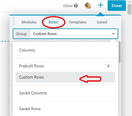
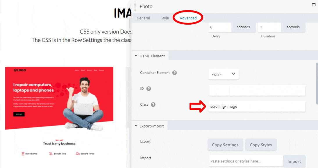
- The individual Photo Modules need the class of “scrolling-image” adding under the Advanced Tab.
See the Image Scroll on Hover template in action.
Code
CSS
/*------------------------------------------------------
"scrolling-image" needs to be added to each photo module
under the advanced tab as a class
-------------------------------------------------*/

.scrolling-image .fl-module-content{
overflow: hidden;
height: 300px; /* change this for height of image*/
}

.scrolling-image img:hover {
margin-top: 300px; /* needs to match the height above*/
transform: translate(0,-100%); /* the transform property makes the magic happen.
The translate value is moving on the axes of x = 0 and y = -100%*/
transition-timing-function: ease-in-out; /* W3 Schools tells us this
"Specifies a transition effect with a slow end (equivalent to cubic-bezier(0,0,0.58,1))" */
transition-duration: 3s; /* change the hover scroll speed*/
}

.scrolling-image img {
transition-timing-function: ease-in-out;
transition-duration: 3s; /* changes the speed scrolling back after hover*/
}

/*------------------------------------------------------
This add the "View" notice when the image is linked"
If not need everything below can be removed
-------------------------------------------------*/
.scrolling-image .fl-photo-content A::before
{
content: "View";  /* Change View to your preferred text*/
position: absolute;
margin: 100px 50% 50% 50%;
width: 100px;
font-size: 14px;
}
.scrolling-image A::before
{
transform: translate(-50%, -50%);
background: rgba(255, 0, 0, 0.8); /*Button color with 20% opacity*/
color: #FFF;
-webkit-font-smoothing: antialiased;
font-weight: 600;
border-radius: 5px;
padding: 16px;
}

/*We use this Chrome extension to capture full pages
https://chrome.google.com/webstore/detail/gofullpage-full-page-scre/fdpohaocaechififmbbbbbknoalclacl
*/